
Composr Tutorial: Introduction to web design
Written by Chris Graham (ocProducts)
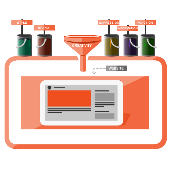
This tutorial is an introduction to the artistic side of web development – web design.Introduction
(Click to enlarge)
Nowadays visitors expect an important website to be as impressive as a glossy magazine, or a TV show, and good design is the route to this.
Design skills
I can't possibly teach design in one tutorial, but I will try to give an idea of the basics, and then point to further resources.Design is about communication: communicating style, communicating a brand, communicating ideas, communication information, and communicating function.
Style and brand
What does a design say? Colour, pattern, language, and many other factors, all imply things about a website and organisation. A well conceived brand consists of certain tenets, and the design implementation of that brand effectively communicates them.Consider a simple example: a website with a dark background, smooth gradients around shades of brown, and vivid and short pieces of text, might be great for a website selling chocolates. It would communicate the simple pleasure of chocolate, and subliminally reinforce the concept via the chocolate-like colours. On every mental level it puts chocolate fully into the mind of the visitor, and can work to trigger the right feelings, and the overall richness and effect works to leave a lasting impression (lasting mental imprint).
However, for this kind of design to be used on an environmental website might be a bit of a disaster:
- The visitor would expect to see green – they'd somehow feel brown was wrong, and perhaps even think the site does not come across as convincing.
- Also, the use of green would work as a trigger/recall to their existing mental model of what 'environmental' is all about. Not using green would be a wasted opportunity.
- Simple seduction and call for a one-off direct-action is not likely to work for a true environmental brand (it might work for some kind of pseudo-environmental natural hair product though). An environmental brand would typically seek to influence based on making someone feel guilty, or fearful of the future, or providing them an opportunity to feel good about themselves. This would typically be done through an eye-catching header, backed up with a substantial body of text.
Brands also have their own distinct 'personalities' which should be reflected. What's the difference between a Reebok and a Nike? The brands will aim to influence a specific group of people in a way that resonates with what is important to them, and use their unique identity to establish a feeling of authenticity, a fashion, and customer loyalty.
Of course, different people think in different ways. As a programmer I think in terms of logics all the time and am very much a "left-brained" thinker (more inclined to study words than pick up from visual cues and emotive techniques). As a software user reading this tutorial you may well be the same. It is critical with design that you learn to appreciate how different people think, and come up with a design that hits all the right spots – that works with different peoples' psychologies.
A brand will typically include a logo, specification of what fonts to use in what circumstances (e.g. headers may have a special font), a colour scheme, a set of reusable styles (e.g. a way to show a box, or a pull-quote), suggested style of language, and a set of brand principles.
Oh… also when it comes to style, things should look pretty!

Ideas and information
How do you communicate complex ideas effectively (we live in an increasingly complex, rushed, media-saturated, world)? One way is just to start typing and hope people will read everything you say. That's a good start, but for important pages of a website you should go a lot further than this.Your text should be organised to draw the right people in, while simultaneously allowing people who won't be interested to not read anything. For example, a good large headline can capture the attention of people, immediately guiding people who are interested to read on, and allowing people who won't be interested to not. Often a web design will have lots of these headlines in different places – such as as titles of boxes placed in highly visible areas.
A common technique is the 'inverted pyramid', and this works very well for front pages. You start with a simple headline, then a longer summary, and continue to the full article. In other words, as people read on they get to see a more thorough version of what you're trying to say. There are many other techniques you can use, such as "pull quotes" (pulling out key parts of text as excerpts, shown in large text near where they appear in the article), or use of bold.
You've undoubtedly heard the phrase "A picture speaks a thousand words" – it's very true, and important to bear in mind. Would you rather read 3 paragraphs, or see a diagram that you can understand at a glance?
Position and style can also communicate ideas, often via use of convention. For example, footer links on websites are a common convention – people know to look there for a "Contact us" link, for example. Use this kind of thing to your advantage.
Function
In a good website, form and function are equally important. Without form, most people are unlikely to be attracted to what the site has to offer and are likely to be confused. Without function it's all a waste of time.Design can be used to make a website user-friendly, by heavy use of convention and visual metaphor. For example, a button with a downward arrow on it by both convention and metaphor, will intuitively be understood to expand some text. A 'carousel' interface (a horizontal scroller) might smoothly fade out instead of harshly cutting off, to imply there is something hidden out of view.
A good design ingeniously uses beautiful form (e.g. icons) to achieve practical ends relating to usability.
Design principles
An attractive design appears as a work of art. However with enough practice anybody can learn how to make such a design, whether or not they have 'natural talent'.The following is true of just about every attractive design:
- There is plenty of white-space. White-space is used to build a 'visual hierarchy'. For example, a title has space around it, implying its dominance. For example, a box has space around it, making it jump out.
- Almost everything in the design will serve a purpose. There is so much to communicate, 'dead communication' can not be afforded. For example, if a background colour is used in a certain area, it is probably to make something seem separate to adjacent text. Keep things simple, and make form and function work in harmony.
- Attention will have been given to dominance. For example, important concepts may be given more space, their own colours, or larger text sizes. This goes both ways – unimportant concepts will be given less spacing. Again, form and function comes together here – different techniques for dominance should lead to a balanced design that comes together 'like a tapestry'.
- There will be attention to detail. For example, the following would look sloppy and distract the viewer from seeing the beauty:
- a word in a headline wrapping onto a second line on its own
- bad JPEG compression
- big chunks of white-space that do not serve any effective purpose
- It will mimic nature. As a species we are naturally inclined to find what nature has attractive to us. Smooth gradients, a lack of abruptness, and complementary colour tones are all usual in nature, and look good.
- The eye is guided to key points via visual points of interest.
- Everything will generally flow visually.
Practical example for beginners: how to make an attractive box
Our box. It's not going to win any awards, but it does the job.
(Click to enlarge)
- give the box a background colour.
- put a border around the box with a colour that is half way between the box's background colour and the background colour of what is adjacent to the box. This will highlight and smooth the transition.
- put a moderate amount of white-space (margin) around the box.
- put a moderate amount of white-space (padding) inside the box.
- make the box float to the right.
In CSS, this would be implemented with something like the following:
Of course, in Composr there are 'standard boxes', so normally you'd actually use one of these, and just style how you'd like them to look by changing the existing CSS. The standard boxes give you built-in consistency, and free features like curved corners.
Resources
If you are really dedicated to being a good designer, the best way to learn is through practice, but also reading good books on design.I recommend the following:
- Graphic design school (ISBN: 0-500-28526-8)
- Universal principles of design (ISBN: 1-59253-007-9)
- Site-seeing (ISBN: 0-7645-3674-5)
To decide on a colour scheme consider an online tool like Colormind.
Web Technologies
Web designs are implemented primarily in CSS. We cover CSS in our Guide to web technologies (including HTML, CSS, and JavaScript) tutorial.Software
The de-facto standard software for making web designs is Photoshop. Photoshop is a powerful, expensive, and complex piece of software, but if you want to make really good designs that aren't visually simple it's probably what you'll want to use. (Simpler designs could be built on-the-fly using CSS, assuming the designer has a good imagination and grasp of the technology.)Instead of Photoshop you could consider:
- Paint.net (free, Windows-only)
- GIMP / GIMPshop (free)
- Corel Paint Shop Pro (cheaper than Photoshop – but less powerful)
There is an enormous amount to know when it comes to using this kind of software, including:
- Colour spaces
- Layers
- Masking
- Filters
- Patterns
- Brushes
- Techniques for using all the little features and tools
You may find the best way to learn is through tutorials. Here are some sites featuring tutorials for Photoshop:
- http://www.tutorialized.com/tutorials/Photoshop/1
- http://www.photoshopstar.com/
- http://design.tutsplus.com/
Tradeoff
It's important to be able to take in, and balance, multiple competing design viewpoints. Let's consider the front page of a website and the "hats you need to wear" from the point of viewpoints of experts in different fields at their most selfish.Artist said
Just leave me alone to create a pixel-perfect work of inspirational art. I'll show you when I'm done.
Salesman said
The whole front page should be sales letter intended to brainwash the reader into making a purchase.
Community Advocate said
The front page should be a space dedicated to the members of the community. A community hub and collaborative work. To not give the visitors a front and centre space makes the website closed and proprietary.
Search-Engine Optimiser said
The front page is the natural 'landing page' for search engines. Pick a set of target keywords and write all your text around them, such as to get the perfect keyword density and placement.
Accountant said
Don't waste too much money on the front page. All investment should be cost-justifiable, otherwise your project might be dumped for not giving a big enough return.
Legislator said
The web page must meet our non-discrimination legislation, or you might be taken to court for being prejudiced. It must be understandable for people with:Make a separate version of the page for different user types if these are not possible to simultaneously achieve.
- cognitive disorders
- blindness
- hearing problems
- alternative control interfaces
Usability Consultant said
Everything should feel natural and obvious. The interface should exactly meet conventions and key navigation elements should never be unique.
Privacy Advocate said
The web page must not take or track anything relating to browsing it. Otherwise my human rights are being violated.
All these experts are making great points, but are taking them to extremes. Therefore it's important to give them all consideration in the design. We can't just follow their advice though, because there are loads of conflicts – the art of tradeoff is our tool.
Let's consider a few of those conflicts:
- The privacy and community advocates could argue forever, as they have completely opposing points of view. Privacy is to keep things secret, while community is to express.
- Accountants and artists could certainly argue over the financial incentive to the art. Artists naturally think in terms of elegance, while for an accountant, art serves a specific need and serves, with a certain effectiveness, to generate revenue that outweighs it's investment.
- Artists and usability consultants could argue over the purpose of art. A usability consultant would see it as something to stimulate understanding, while a pure artist would see it as something that might even be intended to stimulate confusion.
- SEO and salesmen would argue over the language used. SEO would wish to write for a search engine, while a salesman would want absolute control over the wording to carefully place a trail of exact thoughts into the readers head.
- (and I could go on for a long time here)
A good designer/engineer understands all factors relating to their subject, and takes everything on board, with some expertise in all of it, and then creates a design that balances multiple design factors while simultaneously pushing overall excellence and innovation.
Prioritisation
You also need to decide on your priorities and focus.People in any profession will have strong views about how things should be done, but you need to take a few steps back from this when in business and really think what you're trying to achieve. If you're trying to build a brand, or get repeat business, image is very important. If you're trying to get direct sales, copy and SEO is probably important and imagery would just waste good screen space. You can make a great design with great copy and pretty good SEO, but you need to think whether it will create a return on investment, and that really depends on context.
Some professionals will object really strongly to this kind of pragmatic approach, and throw out loads of terms like 'engagement' or 'brand image' or 'differentiation', but these kinds of marketing technique do not apply to every business (a professional is not necessarily very business-savvy, so may not understand this). Does a market stall need brand image? Do you really care to build an engaging relationship with your favourite cheese producer? Do you care about your bank's differentiation?
What's really important is to see what matters in the market you are in and let this guide your decision process. If you can get quick wins in areas that are not key then it's worth it, because everyone consistently cares about relationships and design and authority to some basic extent, but don't waste time and money trying to be all things to all people.
If in doubt, you could survey what is important, but chances are you won't get an accurate result using this technique (people tend to say 'yes' to most "would you like" kind of questions). A better approach is to step through some scenarios with your customers, as that will really show you what they care about, and probably also where your competitors have exploitable weak points.
Concepts
- Photoshop
- The de-facto standard software for web designers
- Visual hierarchy
- A good design lays out elements into a visual hierarchy, where the organisation of the hierarchy helps convey the natural structure of the information
- Information design
- The skill and practice of preparing information so people can use it with efficiency and effectiveness
- Brand
- A set of principles and styles that form a virtual identity
See also
- http://webdesignledger…g-the-right-color-palette
- http://uxchecklist.github.io/
- http://adrien-heury.net/designers-checklists/
- http://www.slideshare.…ical-business-requirement
- http://www.smashingmag…2/designing-for-the-mind/
- http://www.smashingmag…proportion-to-web-design/
- http://www.creativeblo…ncepts-developers-9134391
- https://web.archive.or…quality-within-web-design
- https://www.thedesignedtree.com/
- http://findicons.com/
- http://www.freeimages.com/
- http://www.creativeblo…e-should-answer-101413151
- http://www.userfocus.c…resources/guidelines.html
- http://www.webdesigner…by-eye-tracking-research/
- https://econsultancy.c…he-big-tech-firms-experts
- http://www.uxaxioms.com/
- http://thedesignblitz.…design-mistakes-to-avoid/
- https://pixabay.com/
- Guide to web technologies (including HTML, CSS, and JavaScript)
- Themeing your site
- Helping improve site accessibility for disabled users
- Supplementary web technologies (media, social networking, etc)
Feedback
Please rate this tutorial:

Have a suggestion? Report an issue on the tracker.