
Composr Tutorial: Custom fields
Written by Chris Graham (ocProducts)
When building catalogues, custom fields for inbuilt content types, and Custom Profile Fields, you have a unified set of fields to choose from.This tutorial describes all the different fields and their options.
Text
A note about sorting:Note that text fields will sort using a text sort algorithm. For example, "10" comes before "3", because 1 is less than 3 and it compares characters left-to-right rather than as actual numbers. To get numeric sort you would need a number field type.
short_trans
| Type label | A brief line of translatable/Comcode text |
|---|---|
| Storage format (for programmer reference) | Up to 255 characters of text (linked through translate table) |
| Special default values | None |
| Supported field options | None |
| Back-end UI |
|
| Front-end UI |
|
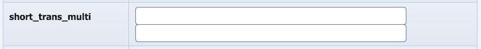
short_trans_multi
| Type label | Multiple brief lines of translatable/Comcode text |
|---|---|
| Storage format (for programmer reference) | Text separated by linebreaks (no character limit) (linked through translate table) |
| Special default values | None |
| Supported field options |
auto_sort=on|off (whether to sort the entered options; default is off) num_required (the number of required values; default is 0 or 1 depending on if required is set) cms_type=line|codename|integer|float|email (which Composr styling and validation code to use; default is line) |
| Back-end UI |
|
| Front-end UI |
|
short_text
| Type label | A brief line of text (no Comcode support) |
|---|---|
| Storage format (for programmer reference) | Up to 255 characters of text |
| Special default values | None |
| Supported field options | maxlength (the number of characters to have as a maximum; default is 255) |
| Back-end UI |

|
| Front-end UI |

|
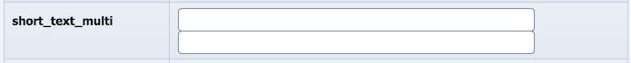
short_text_multi
| Type label | Multiple brief lines of text (no Comcode support) |
|---|---|
| Storage format (for programmer reference) | Text separated by linebreaks (no character limit) |
| Special default values | None |
| Supported field options |
auto_sort=on|off (whether to sort the entered options; default is off) num_required (the number of required values; default is 0 or 1 depending on if required is set) cms_type=line|codename|integer|float|email (which Composr styling and validation code to use; default is line) |
| Back-end UI |
|
| Front-end UI |

|
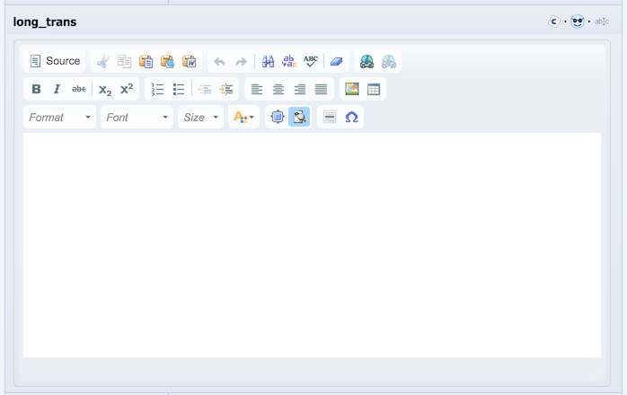
long_trans
| Type label | A paragraph(s) of translatable/Comcode text |
|---|---|
| Storage format (for programmer reference) | Text (linked through translate table) |
| Special default values | None |
| Supported field options |
wysiwyg=on|off (whether to enable the WYSIWYG editor; default is on) wordwrap=on|off (whether to word-wrap lines in the editor, as opposed to horizontal scrolling; default is on) input_size (the number of lines in the text area; default is 9) maxlength (the number of characters to have as a maximum; default is to have no limit) |
| Back-end UI |
|
| Front-end UI |
|
long_text
| Type label | A paragraph(s) of text (no Comcode support) |
|---|---|
| Storage format (for programmer reference) | Text |
| Special default values | None |
| Supported field options |
widget=text|huge (widget type, huge is a full-width input and does not support the input_size option; default is text) wordwrap=on|off (whether to word-wrap lines in the editor, as opposed to horizontal scrolling; default is on) input_size (the number of lines in the text area; default is 9) maxlength (the number of characters to have as a maximum; default is to have no limit) |
| Back-end UI |
Text widget 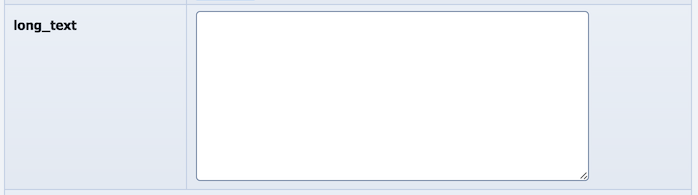
Huge widget 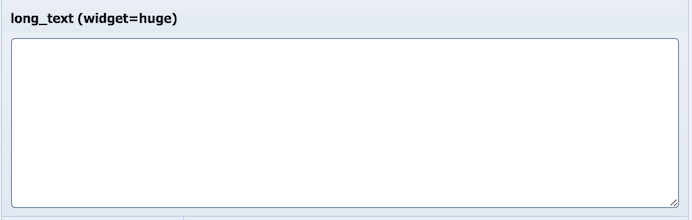
|
| Front-end UI |
Text widget 
Huge widget 
|
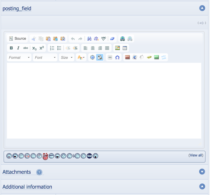
posting_field
Note that you are only allowed one posting_field field per catalogue.| Type label | A paragraph(s) of Comcode, with attachment support |
|---|---|
| Storage format (for programmer reference) | Text (linked through translate table) |
| Special default values | None |
| Supported field options | None |
| Back-end UI |
|
| Front-end UI |

|
codename
| Type label | A codename (short sequence of numbers and letters, no spaces) |
|---|---|
| Storage format (for programmer reference) | Up to 255 characters of text |
| Special default values | RANDOM: 10 random numbers and letters (for catalogues it will be enforced as unique also) [catalogues only] |
| Supported field options | None |
| Back-end UI |
When adding there is no UI if 'RANDOM' was used.
|
| Front-end UI |

|
password
| Type label | A password (i.e. masked input) |
|---|---|
| Storage format (for programmer reference) | Up to 255 characters of text |
| Special default values | None |
| Supported field options | None |
| Back-end UI |

|
| Front-end UI |

|
| Type label | An e-mail address |
|---|---|
| Storage format (for programmer reference) | Up to 255 characters of text (e-mail address, or blank) |
| Special default values | !: Current member's configured e-mail address |
| Supported field options | None |
| Back-end UI |

|
| Front-end UI |

|
Numbers
integer
| Type label | An integer (whole number, e.g. 5) |
|---|---|
| Storage format (for programmer reference) | Integer, or null |
| Special default values | AUTO_INCREMENT: An automatically assigned sequential number [catalogues only] |
| Supported field options | range_search=on|off: search forms will allow a range-based search |
| Back-end UI |

|
| Front-end UI |

|
float
| Type label | A float (decimal number, e.g. 3.2) |
|---|---|
| Storage format (for programmer reference) | Floating point number, or null |
| Special default values | None |
| Supported field options |
range_search=on|off: search forms will allow a range-based search decimal_points=on|off: search forms will allow a range-based search decimal_points_behaviour=dp|trim|price: show exact number of decimal places, trim any zero decimal places off, show exact number of decimal places unless there are none |
| Back-end UI |

|
| Front-end UI |

|
Choices
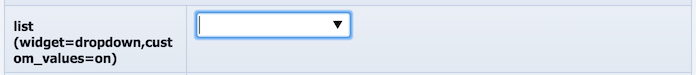
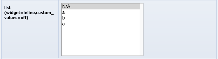
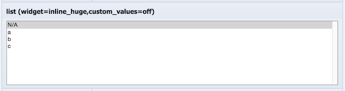
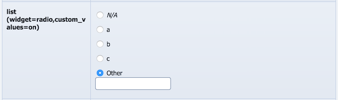
list
| Type label | A value chosen from a list |
|---|---|
| Storage format (for programmer reference) | Selected/input text (programmer note: no character limit, so we can support very long list items) |
| Special default values |
Options are delimited by "|" (e.g. "This|That|Other"), with the real default value coming first. If you want the real default to be blank, start the list with a blank (it won't allow actual selection unless the list is set as non-required). You can also do like "a=This|b=That|c=Other" if you need the saved values to be different from the values displayed for selection, and optionally also displayed on the site. This is called "key-val format". You can input a pathname relative to a .csv file (relative to base directory), if the non-bundled Nested CPF CSV Lists addon is installed. |
| Supported field options |
custom_values=on|off (whether to allow a custom typed value; if enabled then inline list widgets will not be available; default is off) dynamic_choices (whether to feed custom values back in as possible selections for others; default is off) display_val=on|off (when key-val format is used this sets whether it also influences display not just input) value_remap=none|country (if set to country then the full country names are shown for ISO country codes in the list options; default is none) auto_sort=on|off (whether to sort the list options; default is off) input_size (the number of options shown in the list before scrolling is required, applies only to the 'inline' widget type; default is 9) widget=radio|inline|dropdown|inline_huge|dropdown_huge (whether to use a radio buttons, an inline list, or a dropdown list; default is dropdown) csv_heading (the column from the .csv file to use, if the default was set as a .csv file; default is to use the first column) |
| Back-end UI |

|
| Front-end UI |


|
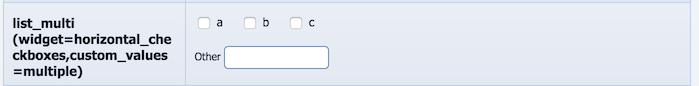
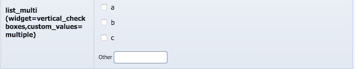
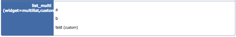
list_multi
| Type label | Multiple values chosen from a list |
|---|---|
| Storage format (for programmer reference) | Selected/input text separated by linebreaks |
| Special default values |
Options are delimited by "|" (e.g. "This|That|Other"). The pathname relative to a .csv file (relative to base directory), if the non-bundled Nested CPF CSV Lists addon is installed. |
| Supported field options |
auto_sort=off|frontend|backend|both (choose front-end to sort the selected choices, choose back-end to sort the list options, choose both to sort both; default is off) show_unset_values=on|off (whether to show non-set list options on the front-end with a cross next to them; default is off) custom_values=off|single|multiple (whether to allow a custom typed value; default is off) dynamic_choices (whether to feed custom values back in as possible selections for others; default is off) widget=vertical_checkboxes|horizontal_checkboxes|multilist (what input style to use; default is multilist) input_size (the number of options shown in the list before scrolling is required, applies only to the 'inline' widget type; default is 5) |
| Back-end UI |

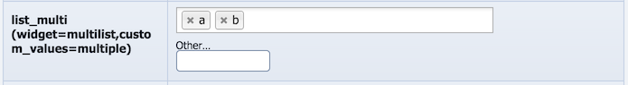
|
| Front-end UI |
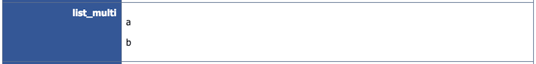
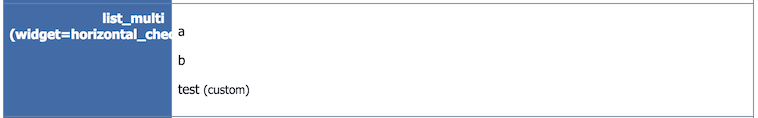
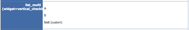
|
tick
| Type label | Checkbox ('Yes' or 'No') |
|---|---|
| Storage format (for programmer reference) | Integer (0 or 1) |
| Special default values | None |
| Supported field options | None |
| Back-end UI |
If set as required it will not actually show as required as it is not possible for it to not have a value 
If set as non-required it will actually be a drop-down input with 3 possible values (N/A, No, Yes) 
|
| Front-end UI |


|
Uploads/URLs
The fields that take "uploaded" files allow you to select files direct from your computer.The first image-like field will be injected into screen metadata (i.e. will come up on Facebook shares due to being the Open Graph image for the entry).
upload
| Type label | An uploaded file |
|---|---|
| Storage format (for programmer reference) | Up to 255 characters of text (<url>[::<original_filename>], or blank) |
| Special default values | None |
| Supported field options | filetype_filter (comma-separated list of file extensions; default is not to have a filter) |
| Back-end UI |

|
| Front-end UI |

|
upload_multi
| Type label | Multiple uploaded files |
|---|---|
| Storage format (for programmer reference) | <url>[::<original_filename>] separated by linebreaks |
| Special default values | None |
| Supported field options |
auto_sort=on|off (whether to sort the entered options; default is off) filetype_filter (comma-separated list of file extensions; default is not to have a filter) |
| Back-end UI |

|
| Front-end UI |

|
picture
| Type label | An uploaded picture |
|---|---|
| Storage format (for programmer reference) | Up to 255 characters of text (URL, or blank) |
| Special default values | None |
| Supported field options |
width (the width all the media will be shown at; default is to auto-detect for each individual file) height (the height all the media will be shown at; default is to auto-detect for each individual file) keep_gps=on|off (whether to keep GPS metadata in images, which is stripped by default for privacy reasons; default is off) |
| Back-end UI |

|
| Front-end UI |
|
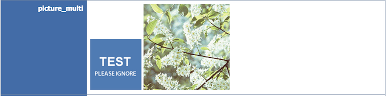
picture_multi
| Type label | Multiple uploaded pictures |
|---|---|
| Storage format (for programmer reference) | URLs separated by linebreaks |
| Special default values | None |
| Supported field options |
width (the width all the media will be shown at; default is to auto-detect for each individual file) height (the height all the media will be shown at; default is to auto-detect for each individual file) keep_gps=on|off (whether to keep GPS metadata in images, which is stripped by default for privacy reasons; default is off) |
| Back-end UI |

|
| Front-end UI |
|
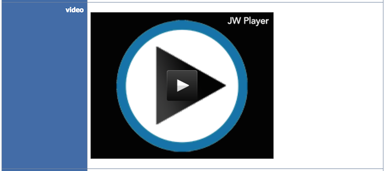
video
| Type label | An uploaded video |
|---|---|
| Storage format (for programmer reference) | Up to 255 characters of text (<url>[ <width> <height> <length>], or blank) (if we can we will transcode the video and create a thumbnail) |
| Special default values | None |
| Supported field options |
width (the width all the media will be shown at; default is to auto-detect for each individual file) height (the height all the media will be shown at; default is to auto-detect for each individual file) |
| Back-end UI |

|
| Front-end UI |
|
video_multi
| Type label | Multiple uploaded videos |
|---|---|
| Storage format (for programmer reference) | <url>[ <width> <height> <length>] separated by linebreaks (if we can we will transcode the video and create a thumbnail) |
| Special default values | None |
| Supported field options |
width (the width all the media will be shown at; default is to auto-detect for each individual file) height (the height all the media will be shown at; default is to auto-detect for each individual file) |
| Back-end UI |

|
| Front-end UI |
|
url
| Type label | An URL |
|---|---|
| Storage format (for programmer reference) | Up to 255 characters of text (URL, or blank); common URL errors will be fixed |
| Special default values | None |
| Supported field options | None |
| Back-end UI |

|
| Front-end UI |

|
url_multi
| Type label | Multiple URLs |
|---|---|
| Storage format (for programmer reference) | URLs separated by linebreaks; common URL errors will be fixed |
| Special default values | None |
| Supported field options | auto_sort=on|off (whether to sort the entered options; default is off) |
| Back-end UI |

|
| Front-end UI |

|
page_link
| Type label | A page-link (i.e. in-site link) |
|---|---|
| Storage format (for programmer reference) | Up to 255 characters of text (<page-link>[ <link-title>]) |
| Special default values | None |
| Supported field options | None |
| Back-end UI |
|
| Front-end UI |

|
theme_image
| Type label | An image from the xxx directory of theme images |
|---|---|
| Storage format (for programmer reference) | Up to 255 characters of text (theme image ID, or blank) |
| Special default values | None |
| Supported field options |
width (the width all the media will be shown at; default is to auto-detect for each individual file) height (the height all the media will be shown at; default is to auto-detect for each individual file) |
| Back-end UI |
|
| Front-end UI |

|
'xxx' may be any theme image directory. There is a version of this field type for each of them.
If you have manually added new theme images and are not seeing field types for them, empty the block cache. The field type list is cached using the block cache for performance reasons.
Magic fields
guid
| Type label | A GUID (Globally-Unique Identifier) |
|---|---|
| Storage format (for programmer reference) | Up to 255 characters of text (though less stored) |
| Special default values | N/A: Default is auto-assigned |
| Supported field options | None |
| Back-end UI | When adding there is no UI. When editing it looks like codename |
| Front-end UI |

|
References
isbn
| Type label | ISBN code |
|---|---|
| Storage format (for programmer reference) | Up to 255 characters of text |
| Special default values | None |
| Supported field options | None |
| Back-end UI |

|
| Front-end UI |

|
reference
| Type label | A reference to a catalogue entry in xxx catalogue |
|---|---|
| Storage format (for programmer reference) | Content ID (to whatever catalogue the reference is for), or blank |
| Special default values | None |
| Supported field options | None |
| Back-end UI |

|
| Front-end UI |

|
'xxx' may be any catalogue. There is a version of this field type for each of them.
reference_multi
| Type label | Multiple references to a catalogue entry in xxx catalogue |
|---|---|
| Storage format (for programmer reference) | Content IDs (to whatever catalogue the reference is for) separated by linebreaks |
| Special default values | None |
| Supported field options | auto_sort=on|off (whether to sort the entered options; default is off) |
| Back-end UI |

|
| Front-end UI |

|
'xxx' may be any catalogue. There is a version of this field type for each of them.
content_link
| Type label | A link to an item of 'xxx' content |
|---|---|
| Storage format (for programmer reference) | Content ID, or blank |
| Special default values | None |
| Supported field options | None |
| Back-end UI |

|
| Front-end UI |

|
'xxx' may be any content type. There is a version of this field type for each of them.
content_link_multi
| Type label | Multiple links to an item of 'xxx' content |
|---|---|
| Storage format (for programmer reference) | Content IDs separated by linebreaks |
| Special default values | None |
| Supported field options | auto_sort=on|off (whether to sort the entered options; default is off) |
| Back-end UI |

|
| Front-end UI |

|
'xxx' may be any content type. There is a version of this field type for each of them.
member
| Type label | A member ID |
|---|---|
| Storage format (for programmer reference) | Member ID, or null |
| Special default values | !: Current user's username |
| Supported field options | None |
| Back-end UI |

|
| Front-end UI |

|
member_multi
| Type label | Multiple member IDs |
|---|---|
| Storage format (for programmer reference) | Member IDs separated by linebreaks |
| Special default values | !: Current user's username |
| Supported field options | auto_sort=on|off (whether to sort the entered options; default is off) |
| Back-end UI |
|
| Front-end UI |

|
author
| Type label | An author configured on the system |
|---|---|
| Storage format (for programmer reference) | Up to 255 characters of text (author) |
| Special default values | None |
| Supported field options | None |
| Back-end UI |

|
| Front-end UI |

|
Other
color
| Type label | A colour |
|---|---|
| Storage format (for programmer reference) | Colour hex code with no "#" (e.g. AAAAAA), or blank |
| Special default values | None |
| Supported field options | None |
| Back-end UI |
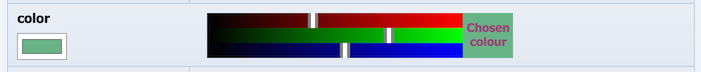
|
| Front-end UI |

|
date
| Type label | A date/time |
|---|---|
| Storage format (for programmer reference) | yyyy-mm-dd hh:mm, or blank |
| Special default values | None |
| Supported field options |
min_year=YYYY max_year=YYYY (defaults place selection +/-10 around current year) range_search=on|off: search forms will allow a range-based search |
| Back-end UI |

|
| Front-end UI |

|
just_date
| Type label | A date |
|---|---|
| Storage format (for programmer reference) | yyyy-mm-dd, or blank (due to fixed alignment, string inequality comparisons work effectively) |
| Special default values | None |
| Supported field options |
min_year=YYYY max_year=YYYY (defaults place selection +/-10 around current year) range_search=on|off: search forms will allow a range-based search |
| Back-end UI |

|
| Front-end UI |

|
just_time
| Type label | A time |
|---|---|
| Storage format (for programmer reference) | hh:mm, or blank (due to fixed alignment, string inequality comparisons work effectively) |
| Special default values | None |
| Supported field options | range_search=on|off: search forms will allow a range-based search |
| Back-end UI |

|
| Front-end UI |

|
tel
| Type label | A telephone number |
|---|---|
| Storage format (for programmer reference) | Up to 255 characters of text |
| Special default values | None |
| Supported field options | None |
| Back-end UI |

|
| Front-end UI |

|
Blank fields
In almost all cases a field left as blank will not show in the default templates at all.'color' is the only exception to this (at the time of writing), as there is no way to actually leave that input field blank.
Styling multiple-selection fields
The fields that support multiple-selection will typically output the different selections sequentially without much styling. It is up to the theme designer to write CSS rules to lay these out in an appropriate way.Programming (advanced)
Generally the fields system is built on top of the lower level fields API within Composr, which is itself built on standard Composr templates.Extending the set of fields
Programmers may add new field types by writing new systems/fields hook code files. Programming is beyond the scope of this tutorial, but it is relatively easy for a programmer to see how the existing hooks were coded (all existing fields are hook-based too).See also
Feedback
Please rate this tutorial:
Have a suggestion? Report an issue on the tracker.