
Composr Tutorial: Using blocks
Written by Chris Graham (ocProducts)
Composr provides features to allow Comcode pages to be very feature rich. This tutorial explains how you can add blocks to your pages. Blocks can be used to display dynamic data such as recent forum posts onto a page (i.e. embedding it within the flower of the wider page). It will give an example of how to add third-party widgets to a page. Finally it will also explain how Composr allows your website content to be organised using different methodologies.Introduction
An illustration to how blocks work
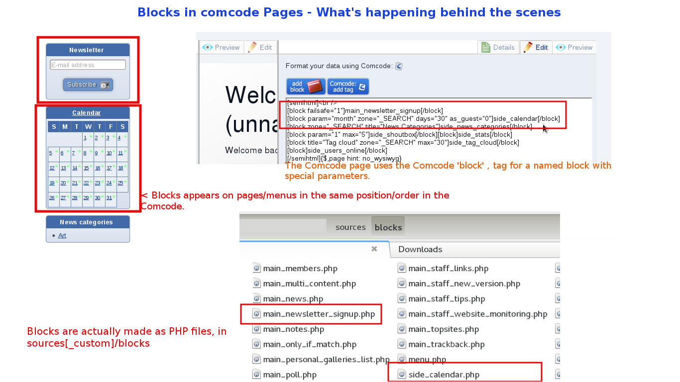
(Click to enlarge)
Composr has a concept called a 'block'. Blocks are building blocks that can be inserted into a Comcode page in order to add the aforementioned interactive and data-bound functionality that is so important to a modern website.
Put another way, blocks are dynamic elements, elements that automatically generate content that could not be pre-prepared. For example:
- a list of recent topics on a forum (main_forum_topics)
- information about the currently logged in user (side_personal_stats)
The default start page in the Welcome Zone, and the panels make use of blocks.
Available blocks
List of blocks
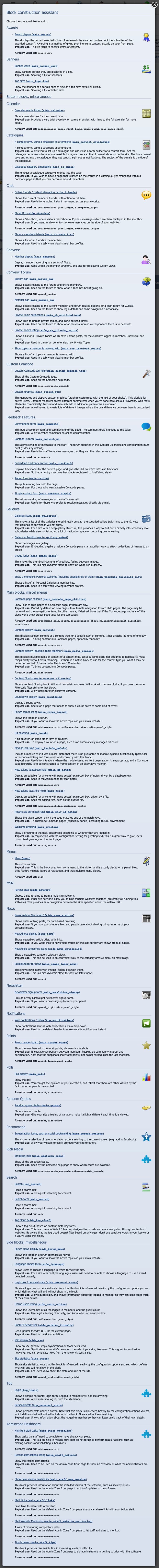
(Click to enlarge)
Sample form for adding a block selected from the long list to the right
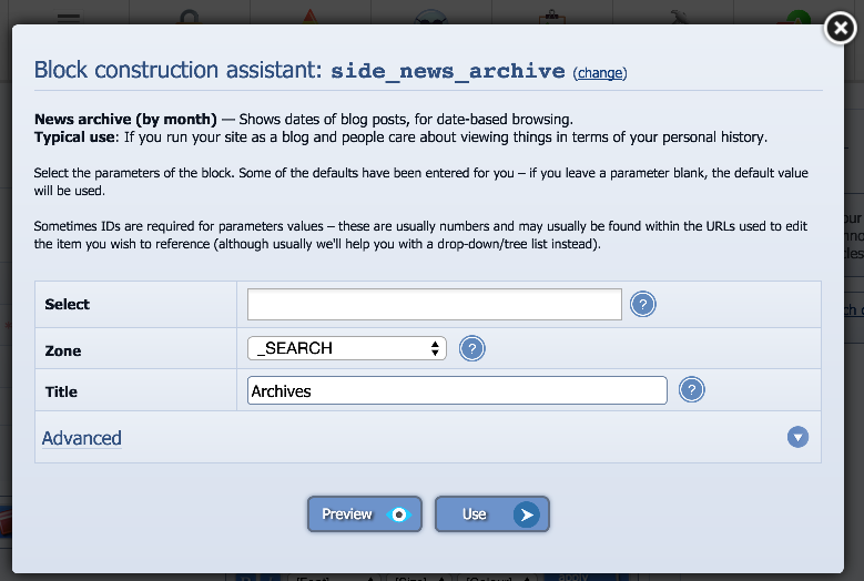
(Click to enlarge)
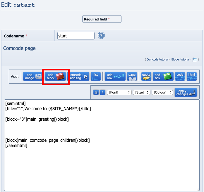
Actual Comcode that references blocks (with WYSIWYG on, highlighting the add block button)
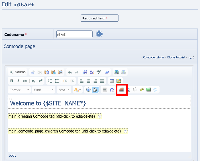
(Click to enlarge)
Actual Comcode that references blocks (with WYSIWYG off, highlighting the add block button)
(Click to enlarge)
The block construction assistant (available as a button above the editor) will help you add a block. It will:
- show you what exact blocks are available (grouped by addon)
- provide a form for setting the block parameters
- let you preview
- add the Comcode for you
The available blocks are classified into the following groups:
- Side blocks: These are intended to be shown on a panel page (i.e. left or right column).
- Main blocks: These are intended to be shown on the body of the site (an actual page).
- Top blocks: These are intended for use in the header of the site.
- Bottom blocks: These are intended for use in the footer of the site.
The above classifications are not forced however. You can use any block anywhere.
For example, it is common to use the main_poll block on a panel.
With some re-styling (changing CSS and/or templates), any visual assumptions about placement may be swept away.
Block code (advanced)
This section is only relevant if you don't want to use the block construction assistant (if you prefer hand-coding) or otherwise wish to understand the Comcode produced.The Comcode to add blocks is easiest shown by example. If you log in to your site as your administrator member, and choose to edit the front page of the Welcome Zone, then you will see the page consists of Comcode: in particular, you will see (if you turn WYSIWYG off) that the [block] tag is used many times in the page.
To use a block, all you actually need to do is to use the Comcode [block] tag, with the name of the block as the tag contents. Parameters passed to the block simply get placed as parameters for the block tag itself.
To move block code around on a page you can cut and paste it. This even works when the WYSIWYG editor is on, as you can cut and paste the placeholder button/code for it.
Comcode syntax
A block called example with no parameters would be included like follows:Code
[block]example[/block]
A block called example with a parameter someparameter would be included like follows:
Code
[block someparameter="somevalue"]example[/block]
If we have multiple parameters:
Code
[block someparameter="somevalue" otherparameter="othervalue"]example[/block]
We have a specially named parameter, param, which many blocks use. You may define it in full like:
Code
[block param="somevalue"]example[/block]
Code
[block="somevalue"]example[/block]
Tempcode syntax
Templates may include blocks via a Tempcode symbol. This also works in Comcode if you prefer to write Tempcode style.A block called example with no parameters would be included like follows:
Code
{$BLOCK,block=example}
A block called example with a parameter someparameter would be included like follows:
Code
{$BLOCK,block=example,someparameter=somevalue}
If we have multiple parameters:
Code
{$BLOCK,block=example,someparameter=somevalue,otherparameter=othervalue}
The special param parameter has no short-hand syntax in Tempcode.
Specific advice on customising Composr blocks
Handling truncation
Often blocks will truncate long lines in order to make sure things fit in to your design neatly. You may want to customise the truncation point to meet your own design/content needs.The truncation is performed within the obvious template for the block. For example, the main_forum_topics block uses a BLOCK_MAIN_FORUM_TOPICS_TOPIC.tpl template that contains this code:
Code
{$TRUNCATE_LEFT,{TITLE},30,0,1}
Styling
Blocks are styled via editing the templates and CSS associated. Typically templates are directly named after the block they are for. For example, the main_news block uses a BLOCK_MAIN_NEWS.tpl template. CSS can be targeted to the HTML within the template in a normal way.Writing HTML and CSS is outside the scope of this tutorial.
Blocks vs Boxes
A common point of confusion is the difference between blocks and boxes.Boxes are a visual convention in Composr. They are what they sound like.
A block does not necessarily have any visual form. It could create a popup. It could hover over the site in a circle. It may take on the form of a greek goddess. In practice, however, a block almost always does actually put itself in a box in the default templates.
Customising a block template, for different circumstances (advanced)
Sometimes you need one block, to look different, in different contexts.The easiest way to do this is using the Tempcode SET symbol.
Let's set up a contrived situation just to make the explanation simple…
Let's imagine on a Comcode page we are displaying the main_quotes block twice, and it should look different each time. We could do it like this…
Code
{$SET,main_quote_display_method,A}[block _="A"]main_quotes[/block]{$SET,main_quote_display_method,}
{$SET,main_quote_display_method,B}[block _="B"]main_quotes[/block]{$SET,main_quote_display_method,}
This puts a setting in a Tempcode variable called main_quote_display_method to identify our "display method", and unsets it after the block is called. The pattern repeats for each display of the block.
We had to do a little fudge with the _="A" and _="B" stuff. This is to stop Composr internally caching the block's displayed Tempcode into a single unit while it is generating the page. All we have done is set a non-existent parameter (_) to a different value each time to cause Composr to not try and optimise things for us. We could have actually used any random parameter names and values, there's no real relationship with the values we stored in main_quote_display_method.
And then alter the BLOCK_MAIN_QUOTES.tpl template like…
Code (HTML)
{$GET,main_quote_display_method}
{+START,IF,{$EQ,{$GET,main_quote_display_method},A}}
<p>
<strong>Random quote:</strong> {CONTENT}
</p>
{+END}
{+START,IF,{$EQ,{$GET,main_quote_display_method},B}}
<p>
{CONTENT} (our random quote)
</p>
{+END}
{+START,IF,{$NEQ,{$GET,main_quote_display_method},A,B}}
<section class="box box___block_main_quotes"><div class="box_inner">
{+START,IF_NON_EMPTY,{TITLE}}<h3>{TITLE}</h3>{+END}
<blockquote class="quotes_block">
{CONTENT}
</blockquote>
{+START,IF_NON_EMPTY,{EDIT_URL}}
<ul class="horizontal_links associated_links_block_group">
<li>{EDIT_URL*}</li>
</ul>
{+END}
</div></section>
{+END}
We have latched onto the value of main_quote_display_method, providing different output if it has values A or B, or the normal Tempcode for the template if it is neither A nor B.
That's it
 .
.It's worth pointing out that there are some other similar approaches for similar situations:
- Using the MATCH_KEY_MATCH or _GET symbols to distinguish by URL parameter, if the different block layouts are for different URLs. This doesn't apply to the above example as in the above case the block is looking different within a single page. If it's looking different between different pages then this is a great approach.
- If the issue is with a shared template rather than a block, the _GUID parameter is usually passed in different for each different place the template is used, so you can base logic around that value. GUIDs are explained in the Tempcode Programming tutorial.
- If the particular block supports template sets, you can differentiate based on this. For example, the menu block allows you to specify the 'type' of the menu, which determines which templates will be used. You can therefore invent your own new 'type' of menu and store the HTML for it in a new set of templates. Not much in Composr template sets though.
- Sometimes there is a particular template parameter value that you can tie your logic into. For example, if we are making the NEWS_BOX.tpl template look a little different for a particular news category, we could latch on to the CATEGORY parameter carrying the name of that news category.
Third-party widgets
Many websites provide widgets that you can embed.Composr has some built-in support for many, try just pasting in a normal URL and it may embed satisfactorily. This works for Google Maps and Youtube videos, for example.
If you need to manually embed widget code it is very simple. If you are in the WYSIWYG editor, open the source view (HTML view) of the editor, and paste it in there. If you are not using the WYSIWYG editor then paste it in inside an [html]...[/html] tag.
These widgets aren't Composr blocks, but we are including this explanation in this tutorial because of the similarity.
Practical example: Vonage Video API
You can add a video chat box to your site without any special API integration, just via a simple HTML embed. Here's a brief step by step to go through the process:- Sign up for an account at Vonage Video API
- Create a Comcode page on your site where you want the video chat/conferencing to be located
- Include the provide embed HTML code from Vonage on your Comcode page. You may have to go into View Source mode if using WYSIWYG (ideally, you should disable WYSIWYG on this page). Save your Comcode page. If possible, save unvalidated so it is not yet visible to the public.
- Click Click to start call to test your embed.
- Go back and fill in the rest of the page data and save the page, this time with validated set to on.
If the size is not quite right you can modify the width and height easily to make sure it fits into your website nicely. Your website users will need to sign up to TokBox to use the video conference.
Theory of WCMS sitemaps (advanced)
Website content organisation
Web Content Management systems typically provide one of two systems for organising content:- Organising content types separately via modules
- Organising content types together via a single tree structure (or often, just categories without an actual tree structure)
Composr organises content types via modules (with their own tree structures), but it also provides functionality so that your website can appear organised under a single tree structure.
Comcode pages may be organised to form that tree structure and then those Comcode pages may have blocks placed within them to display content.
You can even give Comcode pages multi-part paths to simulate a directory structure all from within a single Composr zone (by editing the page monikers).
Embedding entries
To embed entries in a Comcode page you may use the main_content block. This is described in more detail in the Featuring content tutorial.Embedding categories
The main_multi_content, main_cc_embed, main_gallery_embed and main_news blocks allow you to pull in multiple entries (e.g. all entries in a particular category) and embed them within a Comcode page.Embedding anything
We provide a special module→block feature to integrate any module screen into a Comcode page. This is done using the main_include_module block. Further details in the Featuring content tutorial.See also
- Comcode and the attachment system
- Featuring content
- Advanced Comcode
- Adding standalone pages of content (via Comcode)
Feedback
Please rate this tutorial:
Have a suggestion? Report an issue on the tracker.