
Composr Tutorial: Mobile design
Written by Chris Graham (ocProducts)
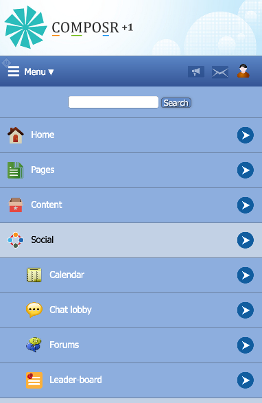
Mobile mode for the forum. This site is the out-of-the-box default, the panels are shown underneath the main page. On real sites you'll likely want to turn these off on mobile mode and move them to their own pages.
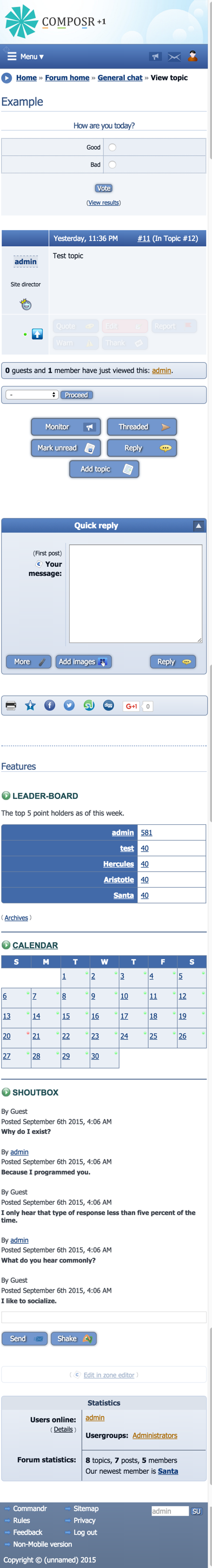
(Click to enlarge)
Showing the default menu type in mobile mode
(Click to enlarge)
- Mobile mode
- Responsive Design
This tutorial explains which you might choose, and provides some guidance.
There is also an API for making native mobile apps for Composr called Composr Mobile SDK.
The two methods
Responsive design allows page layout to adapt to different browser sizes (i.e. different screen sizes, particularly between desktops, tablets, and smartphones). It is fun to test on a desktop machine – on a responsive site you can resize your browser window and see major changes to how a page looks. Adaptability was always a consideration to some extent in web design, but responsive design takes it to a totally different level. Responsive design is based around "media queries", whereby the CSS author defines the browser width thresholds where different style rules will apply and the different rules for each. As a standard CSS technology there is nothing special Composr has to support to allow you to use it – you can use it right away as long as you are comfortable writing CSS (which you need to be anyway if you are doing a major themeing effort).Mobile mode on the other hand works via serving different HTML based on whether the viewer is on a desktop/tablet machine compared to a smartphone. Composr supports QVGA mobile resolution for all frontend screens in mobile mode. The choice between mobile and desktop mode is made by automatic analysis of the browser "user agent". The default theme also has a link in the footer to change what was autodetected.
Which is better?
There is an engineering decision to be made for any site to decide what is best for that site. Don't just assume responsive design is newer and better, because there really are trade-offs involved. If you look at popular sites like Google or Facebook or YouTube, you'll see they have a separate mobile mode, and it's for this kind of reasoning. Other popular and modern websites, like tech news sites or company sites, often have really good responsive design.The default theme uses a small amount of responsive design so that pages look good on both tablets and desktops.
Otherwise, mobile mode is the way mobile pages are served in the default theme. This however is only our default: we do it like that for practical reasons, as most users aren't in a position to put a lot of thought into maintaining quality responsive design CSS (it's a bit too complex for the average webmaster).
Ultimately the control and decision is in your hands.
Pros of responsive design:
- Optimise against a wider range of devices, including different sizes of tablet and phone
- Show something mind-blowing for desktop users with huge browser windows
- No complexity of there being a mode choice in the system
Pros of mobile mode:
- Simpler to test: only two modes
- It makes it easier to understand page structure, as there is a particular layout for desktop, and a particular layout for mobile, and you don't need to think of everything as very fluid
- More powerful than CSS, as HTML structure can be served in a totally different way
- Page structure can be optimised based on screen size and bandwidth; for example, long pages can be served to desktop users, and lots of smaller linked pages to mobile users
- Lower bandwidth: it does not send all style rules for all devices to mobile users on poor network connections
If sites are relatively simple, giving content without a lot of features, and a good amount of design time is being put into the theme, we would recommend a responsive design. Also, magazine-style sites work really well as responsive designs.
If sites have a lot of features through which interaction might happen, and you don't have a lot of time/experience for themeing and optimising it all, the mobile mode is a more efficient way of building out your site.
Configuring mobile mode
You can choose to enable mobile mode only on a per-page basis if your content/layout isn't fully compatible (most complex fixed width designs would have problems if a lot of attention is not given). Devices like iPhones automatically go into mobile mode, so you don't want it to load up mobile display settings and overlay them on content that doesn't work, as it can make a big mess.To activate the feature you need to put this in your themes/<themename>/theme.ini file:
Code (INI)
mobile_pages=forumview,topicview,topics,vforums
On devices like iPhones or Android, desktop mode still works, it just uses zoom like any website not optimised for mobile would. Mobile mode is much nicer of course.
Advanced
You can also use regular expressions. If the expression passes, then mobile mode will be used. For example:Code (INI)
mobile_pages=#:(?!.*(foo|bar)).*$#
It's a complex example. It's not front-bound (no ^ at the start) hence why any zone works.
The black-listed pages are specified within a single "negative forward assertion".
Any regular expression will work, this is just an example. Composr recognises a regular expression by the surrounding # symbols.
Mobile mode themeing
You can use the Tempcode {$MOBILE} symbol to make changes based on what mode things are running in:Code
{+START,IF,{$MOBILE}}
This shows to mobile devices.
{+END}
{+START,IF,{$NOT,{$MOBILE}}}
This does not show to mobile devices.
{+END}
This works in Comcode pages, templates, and also CSS.
If you do not want certain pages to use mobile mode at all then you can edit the theme settings to white-list which pages you have taken to time to optimise for mobile.
Using responsive design techniques
Responsive design is straight-forward to implement for anyone familiar with CSS. Rules are coded into the CSS under media queries such as:Code (CSS)
@media screen and (max-width:999px) {
* {
color: red !important;
}
}
* {
color: red !important;
}
}
In practice you add rules targeting particular display widths to rearrange content appropriate to the particular viewport size.
Responsive design is quite easy to test: you just resize the browser window up and down and see things immediately change.
Typically responsive design will be done to target for:
- Smartphones (320px)
- Small tablets (640px)
- Large tablets (768px)
- Regular desktop windows, i.e. non-full-screen (990px, leaves 34px for scrollbars)
- Very large desktop windows (1200px or more)
It is generally wise to start making things look good on smartphones, then tune things for the larger viewports. This is because:
- Smartphones are the most common device for casual browsing
- It is a better situation to have something blown up to a larger size (actually users often like this) then it is to have it not fitting on a mobile screen
Composr's default theme supplies high-resolution icons for hi-dpi ("retina") displayed using CSS media queries and srcset in the HTML.
This means even if a design is blown up, the user will still benefit from higher fidelity graphics than the adjusted viewport may otherwise suggest.
In fact, the very basis for hi-dpi displays is to operate like this – the extra resolution is used for fidelity, not for cramming more in.
When designs are blown up then the pixels referred to in CSS are not real pixels, they are proportional to the viewport that has been designed.
Pixel resolution and viewports
Some background
Through the early web, computers got better resolutions over time while screen size didn't change all that much. In other words, a higher dpi (dots/pixels per inch).Later, the trend changed, and we got larger and larger screens instead.
The problem with this was that a physical width never corresponded to the width in pixels, and web designers of course work in pixels. So, the larger the resolution, the smaller the text / design elements, which of course is not great for people with eye-sight issues.
When iDevices, and later, Android devices (together, "mobile devices") came out, a fundamental but misunderstood change happened. We got the concept of "device pixels" which are distinguished from what I will call "rendering pixels".
The best way to think of this is probably that web pages now always have a zoom level, and you pan them. It's very different from having a scrollbar or a resized window, which would be the case on a desktop screen.
For both mobile devices and desktops, you have a webpage which is rendered on a "canvas", and then you may have scroll bars (on a desktop) or panning (on a mobile device) to make up whatever difference between the size of the canvas and the size of the user's viewport.
If a mobile device is zoomed out, you may not get the full fidelity of the design on the actual screen (i.e. there's some loss due to down-scaling). If a mobile device is zoomed in, it can actually be scaled up beyond the actual fidelity. This is also true when zooming in/out on desktops, but users do this less frequently than they do on mobile due to the lack of need and lack of easy pinch gesture.
The important thing to take away from the above is that scaling is happening almost all the time on mobile, so the pixels things are displayed at don't reflect the actual pixels specified within the web design.
The scenario was extended further when "retina" devices came out. Even though we were doubling the number of pixels across and down (so quadrupling), the perceived display size of sites would be desired to remain the same. We're not going to quadruple the amount we display on the screen and make everything physically tiny, yet we still have to cater for users without the retina screens, and yet we want benefit from our better screens. Retina solves this by composing onto a canvas of the full retina resolution with all the measurements scaled up 2x to correspond to this – and higher resolution assets (icons etc) on the page retain the full fidelity that this larger canvas can support. This really hits home the fact that the "pixels" a web designer works with are virtual rather than physical units (i.e. the physical pixels are smaller), and the browser will be smart enough to use whatever fidelity it can between the source material (high resolution images, anti-aliased text, etc) and whatever resolution the screen can take.
How the viewport is specified
On a desktop, the designer does not specify the viewport. The user does via the size of their browser window.On a mobile device, the designer can specify the viewport via the viewport meta tag.
This tag specifies a number of constraints, but the main one is the 'width' in rendering pixels that the physical screen is mapped to. If you want to compare this to a desktop, it is like the size of the window that the mobile device's full physical screen width has mapped onto it, with zooming used to achieve that mapping.
You can either set a viewport width in pixels, or set it to 'device-width' if you want the zoom factor to essentially be 1.0 (i.e. not zoomed). Setting it to 'device-width' is very much like setting a fluid website design rather than a 'fixed-width' website design. You are asking the mobile device to flow content to fit onto it, making maximum use of its resolution for fitting stuff on.
What Composr does
This is the code Composr now uses in HTML_HEAD.tpl:Code
{$,iPhone/Android/etc should know they have an optimised design heading to them}
{+START,IF,{$MOBILE}}
   {+START,IF,{$NOT,{$_GET,overlay}}}
      <meta name="viewport" content="width=device-width, initial-scale=1.0" />
   {+END}
   {+START,IF,{$_GET,overlay}}
      <meta name="viewport" content="width=285, user-scalable=yes" />
   {+END}
{+END}
{+START,IF,{$NOT,{$MOBILE}}}
   {+START,IF,{$CONFIG_OPTION,fixed_width}}
      <meta name="viewport" content="width=982, user-scalable=yes" />
   {+END}
   {+START,IF,{$NOT,{$CONFIG_OPTION,fixed_width}}}
      <meta name="viewport" content="width=device-width, user-scalable=yes" />
   {+END}
{+END}
In Composr, mobile mode is used for smartphones. Tablets do not use mobile mobile. I realise in my explanations so far I have referred to tablets as mobile devices, but you'll need to put that aside now ;-). They are mobile devices in the sense they have a touch screen and a panned viewport, but not in the sense of Composr reducing down it's layout via it's mobile mode. As you can see, we define separately for mobile mode (again, smartphones) and non-mobile mode (essentially this means tablets, as desktops won't use the viewport setting).
I'm going to simplify things down a bit for my explanation, removing the stuff in our code about overlays. It's not worth the added confusion.
Code
{$,iPhone/Android/etc should know they have an optimised design heading to them}
{+START,IF,{$MOBILE}}
   <meta name="viewport" content="width=device-width, initial-scale=1.0" />
{+END}
{+START,IF,{$NOT,{$MOBILE}}}
   {+START,IF,{$CONFIG_OPTION,fixed_width}}
      <meta name="viewport" content="width=982, user-scalable=yes" />
   {+END}
   {+START,IF,{$NOT,{$CONFIG_OPTION,fixed_width}}}
      <meta name="viewport" content="width=device-width, user-scalable=yes" />
   {+END}
{+END}
You can see mobile mode is fitted to the device-width. This is to make optimum use of the screen for fitting stuff on, which is arguably the best thing for a device of such limited size. If you are going to spend time making a very mobile-optimised site, you'd probably change this to a width in pixels that you'd designed for, and smile knowing that it was prettier for retina users (higher fidelity mapped onto the width, not scaling your images down so much, and seeing smoother anti-aliased fonts) but discernible without zooming for all smartphone users who have a certain base device resolution.
You can see that tablets have different settings depending on whether Composr is set to fixed-width or not. If Composr is set to fixed-width, it matches the viewport to the default fixed width our CSS declares (982 pixels). Otherwise, it uses device-width in a similar way to smartphones.
An example: fixed width mobile designs
Let's say your base smartphone will be the resolution of the original iPhone, i.e. a width of 320 pixels.(The retina iPhones have upwards from 640 pixels)
You therefore would optimise your design for 320 pixels, but have source imagery of higher resolution in your actual assets.
You'd specify your smartphone viewport as 320 pixels, rather than using the device-width (which Composr is using by default, as discussed earlier).
On an old iPhone, this would be a direct correspondence with the device resolution. i.e. no scaling.
On a retina iPhone, it would be scaled 2x, although the user would not have any idea about that because they don't see things as bigger/smaller because of the correspondingly higher display density. Your high-resolution assets and font anti-aliasing would make it look great, you'd get the 2x fidelity the device could handle: more than 320 individual pixels per row would render in terms of what would be happening on the actual device. From the point of view of your CSS though, the canvas would be 320px across, and assuming the user hadn't zoomed in further, so would the viewport. It's confusing, clever, and really important to understand.
A scenario: fluid mobile designs
If you want to fit as much onto the screen as possible, rather than going for the fixed width but variable fidelity, then you may still want to do some trickery.For example, you may want a logo to stretch right across the screen, yet have the rest of the design be fluid.
For this kind of thing you would use CSS, e.g. "width: 100%" on the image.
initial-scale
If you set the viewport in pixels and set it to be more than the user's device actually has, the user's device will probably initialise so they need to pan across to see everything in the viewport. If you set it to initial-scale=1.0 then a lower-resolution device will fit everything without panning which usually is a better experience assuming that you have made a reasonable effort to optimise your mobile layout (if you have a small font size or detailed images, it may not be possible to fully make out unless the user zooms).The naming of initial-scale is a bit confusing. Think of it in terms of the user's understanding of the zoom level, rather than the designer's. If it is 1.0 then from the user's point of view, they start fully zoomed out; that usually does not mean the devices physical width is going to correspond with the width of your viewport, so in reality scaling/zooming is still going on. You're best of "forgetting" what the physical width of the device is from the point of view of defining CSS widths/viewports, and think of the physical width only when considering discernability.
You can also set viewport setting to specify whether the user is allowed to manually zoom or not, and what the constraints on that should be.
Debugging
Google Chrome has excellent developer tools for simulating different mobile devices.General advice for designing on mobile
While mobile/tablet devices are amazing in their power, they are still fundamentally limited when compared to traditional desktop browsers.Here are some things to bear in mind:
- Mobile processors are much slower than desktop processors. Don't overload your site with too much JavaScript.
- Users will often be accessing on slow mobile connections, so keep your page weight reasonable.
- Don't try and squeeze too many dynamic features on any single page. Instead you should take it as an opportunity to allow your design to 'breath' and spread features out over a number of pages.
- The idea of 'hovering' (hovering the mouse) is not really there on mobile. Browsers let you tap to activate hover status, but it's really not very good.
- Never put critical data inside tooltips. Consider tooltips an enhancement that benefit desktop users, rather than a key place where you can put important information.
- Don't spend too much energy making fancy hover states (fades, colour changes, etc) for things if your audience is unlikely to see them.
- Avoid drop-down menus, or make it so that either:
- the top level of a drop-down node is not a link but will instead allow tap to open the drop-down
- the page linked to via the top level of a drop-down node has navigation within that page (i.e. links). Therefore the drop-down options are no more than shortcuts for desktop users, not essential navigation
- Don't design anything within a page to use scrollbars, as this is poorly supported on mobile (of course, scrolling on the main page is fine)
Tapatalk
There is an official Composr addon (non-bundled) for implementing Tapatalk support for Composr. Tapatalk is a third party forum app for smartphones that can connect to your own forum, providing a high-quality experience to users.Smart app banners
If you have an iPhone app too, you can promote that up using smart app banners.It's not specifically a Composr feature, but can be enabled via putting the appropriate tag into your HTML_HEAD.tpl template.
See also
- Designer themes, implementing a clean-room design
- Themeing your site
- Mobile apps via Composr Mobile SDK
Feedback
Please rate this tutorial:
Have a suggestion? Report an issue on the tracker.