Composr Tutorial: Fixed-width layouts
Written by Chris Graham (ocProducts)
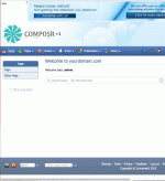
A fixed-width Composr site
A topic of regular disagreement in web design is whether 'fixed-width' designs or 'fluid' designs are better. A fixed-width design is one where the horizontal width of the website is fixed, so that it doesn't change when different resolutions are selected.
Proponents of fixed-width argue:
- that fluid designs (non fixed-width designs) can not function well, because things will always break down when the width significantly exceeds what was tested
- that fixed-width designs are easier to implement
- that fixed-width designs are easier to read from
- that fixed-width designs are more attractive, because it allows more artistic control
A fluid-width Composr site with a relatively thin browser window. Composr's default theme defines a minimum width of 1024, hence the scrollbar.
A fluid-width Composr site with a relatively wide browser window stretching the layout
- that fixed-width designs make unreasonable assumptions about how websites should be viewed; for example, mobile devices would fail to have enough width for a typical fixed-width design yet are prevented from automatically performing adjustments
- that people with large resolutions can always make their browser window smaller
- that using fixed-width is done by those that are applying traditional design skills to the new online medium without adjusting them properly for that medium
Most modern designs are fixed width on desktop computers, and have "responsive design" adjustments to make them look good on different devices.
See Also
- Guide to web technologies (including HTML, CSS, and JavaScript)
- Themeing your site
- Mobile design
- Introduction to web design
Feedback
Please rate this tutorial:
Have a suggestion? Report an issue on the tracker.


